Music / Meaning / Meandering : The inspiration behind songwriter Amy Hooper's Brand

I got the pleasure of getting to know Amy Hooper (a singer/songwriter from Austin) very well last year on a trip to China with Austin Sound Exchange. We were roommates, bouncing around from one Chinese college campus to another, after only a few short introductions. (I believe we initially hit it off so well because we both have weird food needs, which was pretty interesting to navigate around in a foreign country!)
If there's one thing I can say about Amy, it is that she is a servant, but not in the doormat kind of way. She's creative and strong, but also incredibly caring and empathetic. This is what I believe makes her such a great writer, and this is what has strongly influenced my vantage in designing her brand.
How to Design This Logo:
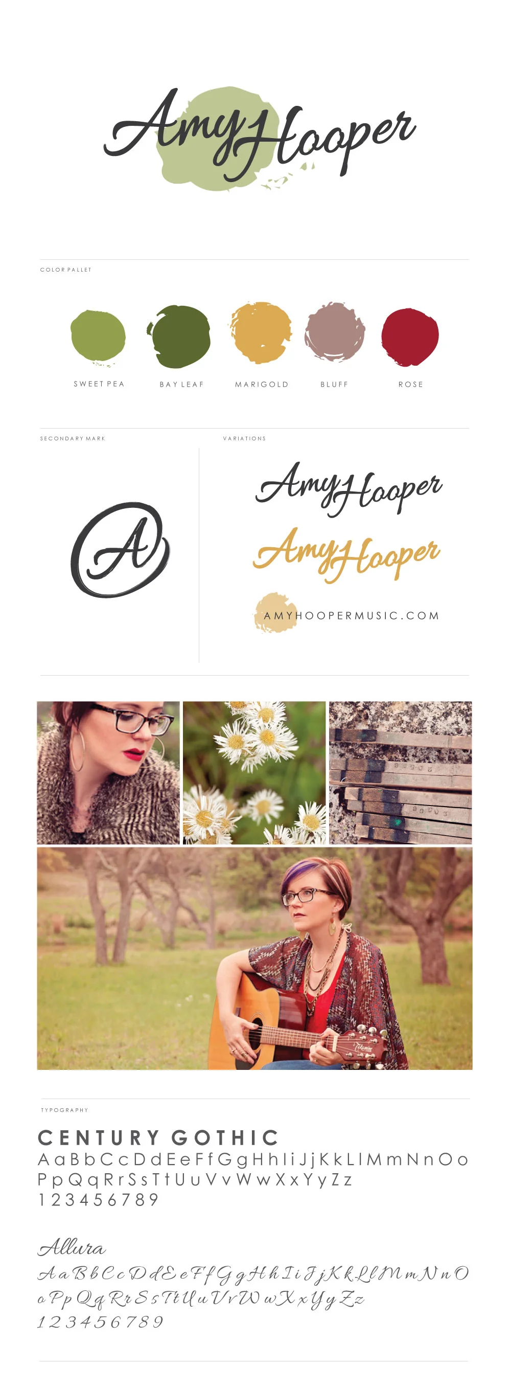
Amy requested a handwritten font, but something more strong than girly. We decided to go with the Allura font, as it was exuberant, but not incredibly flashy or whimsical. I believe the ampersand "A" icon (which was her idea!) really sealed the deal for the both of us.
After choosing the font, the rest was relatively easy. I simply laid out the names by applying a small, 3 point shear to each letter and angled each name up to the right a few degrees as well. This made the last Y and first H come together a little more smoothly. Then, I increased the A and H in size roughly 15%, and applied a paint stroke treatment around the edges for a more customized look.
The ampersand was relatively easy. I opened the "gliphs" window from the "Fonts" tab, and chose the ampersand gliph. I then was able to simply erase the existing A and apply the same A and letter treatments from the logo I had already designed to the new icon.
I decided upon the brand theme colors by pulling out some hues from the excellent and beautiful photos that Amy already had ready to go.